Original Brand: TrustEngine
THE PROBLEM
The new branch of a digital marketing agency needed branding that was able to boldly and confidently stand alone as well as side-by-side with the parent company. It was important that the identity felt both trustworthy and dynamic, contemporary and full of energy.
THE PROPOSAL
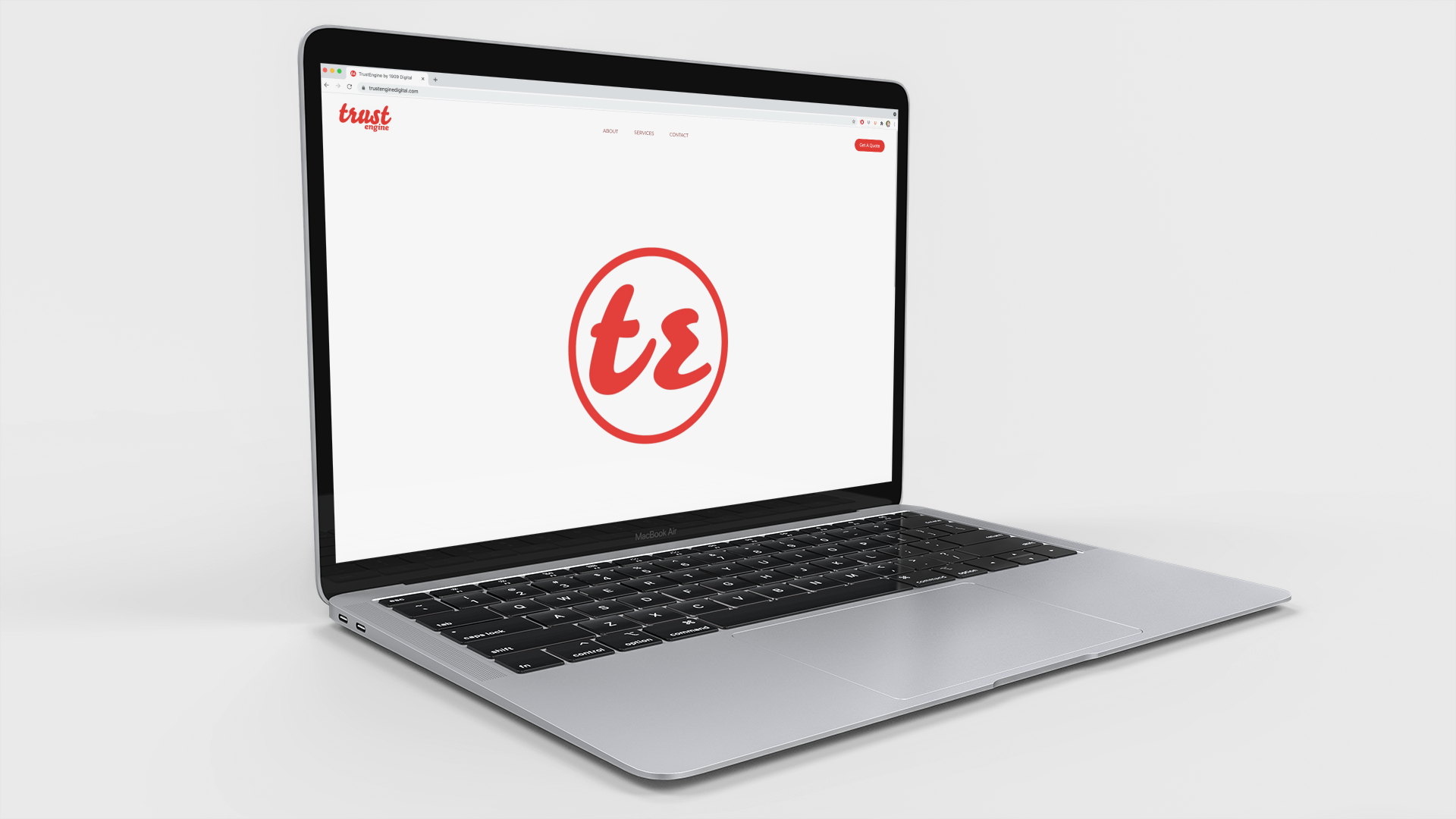
Combining the warmth of a brush script with the authority of a geometric sans serif, I developed a visual system built on movement and strong shapes. The primary red complemented the existing gold and navy but did not rely on them to be effectively used. Generous white space and strong contrast were primary qualities for look and feel.
IN PRACTICE
In addition to the core brand package including an original logo suite, brand colors, and official typefaces, I created motion graphics for the company launch and additional marketing collateral.