Re-brand: Conserv
THE PROBLEM
A Software as a Service start-up wanted an updated visual identity better aligned with their core values. The new branding needed to communicate the company’s speed and creative energy as well as their value for community through an approach that was as fun and accessible as it was professional.
THE PROPOSAL
I encouraged the team to be as bold in their use of color, type, and space as they were with their software development — to be guided by the primary brand keywords: visionary, empowering, trusted. Rather than aligning with competitors who had control of the greatest market share, I chose to emphasize the aesthetic sophistication of their audience.
IN PRACTICE
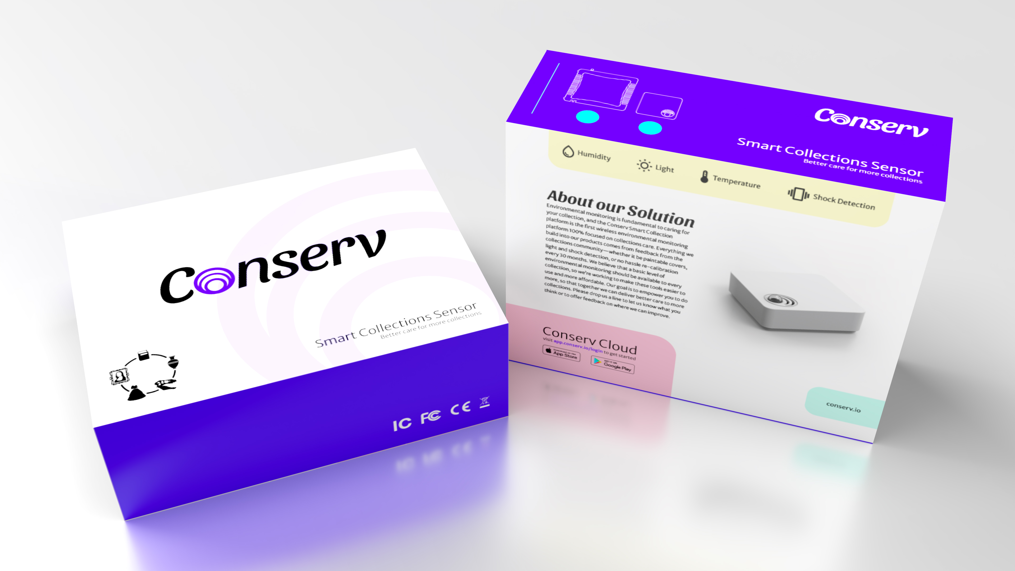
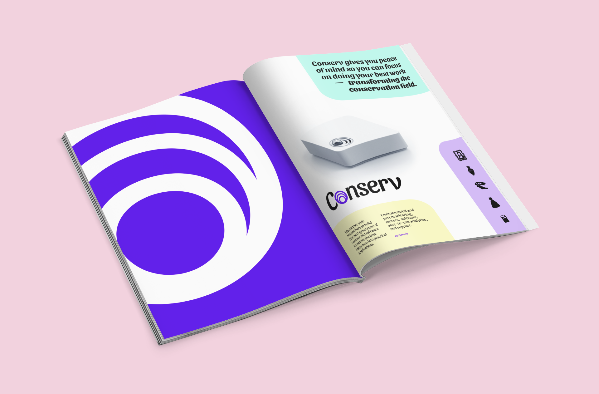
Working with the existing brandmark to retain brand equity, I created a new logotype and logo suite, an expanded palette with bolder brand colors, official typefaces for website and app use in addition to print, and a custom icon set to clearly communicate the breadth of collections and diverse audiences served.